It doesn’t matter how good your product or service may be, or what kind of deal you’re offering potential clients. If you can’t clearly communicate your value proposition through a well-written and well-delivered presentation, you’re never going to land the sale.
Savvy salespeople know that it isn’t just what you say. It’s how you say it. That’s why they invest in improving their proposal development and presentation skills in order to avoid the common mistakes too many sellers fall victim to.
Here are 7 sales presentation mistakes to watch out for — whether you’re a new salesperson looking to up your game or an experienced seller trying to refine your technique.
Mistake #1: Presenting a generic proposal
According to some estimates, as many as 90% of sales proposals don’t lead to sales. That’s a whole lot of wasted opportunity, if you ask me.
One major misstep that can lead to failed sales is a lack of customization. Think about the way you feel when you receive a generic sales outreach email. The same sentiment applies to sales proposals. If your prospects don’t feel your proposals personally speak to their needs, they’re going to ignore you.
Fortunately, tools like PandaDoc make it easy to customize every proposal you send. PandaDoc interactive proposal software makes it possible to include elements such as interactive mock-ups and rotating graphs. It’s almost harder to not personalize your proposals with available features like these.
Mistake #2: Skimping on the visuals
We’re long past the days when PowerPoint-style imagery is enough to help you stand out from the crowd. Today, you need visuals that don’t just look good, but that effortlessly communicate your company’s brand positioning, your industry trends, and your prospects’ expectations.
PandaDoc offers more than 450+ templates so that you can create distinct, personalized and memorable sales presentations. Take the Digital Marketing Proposal Template as an example:
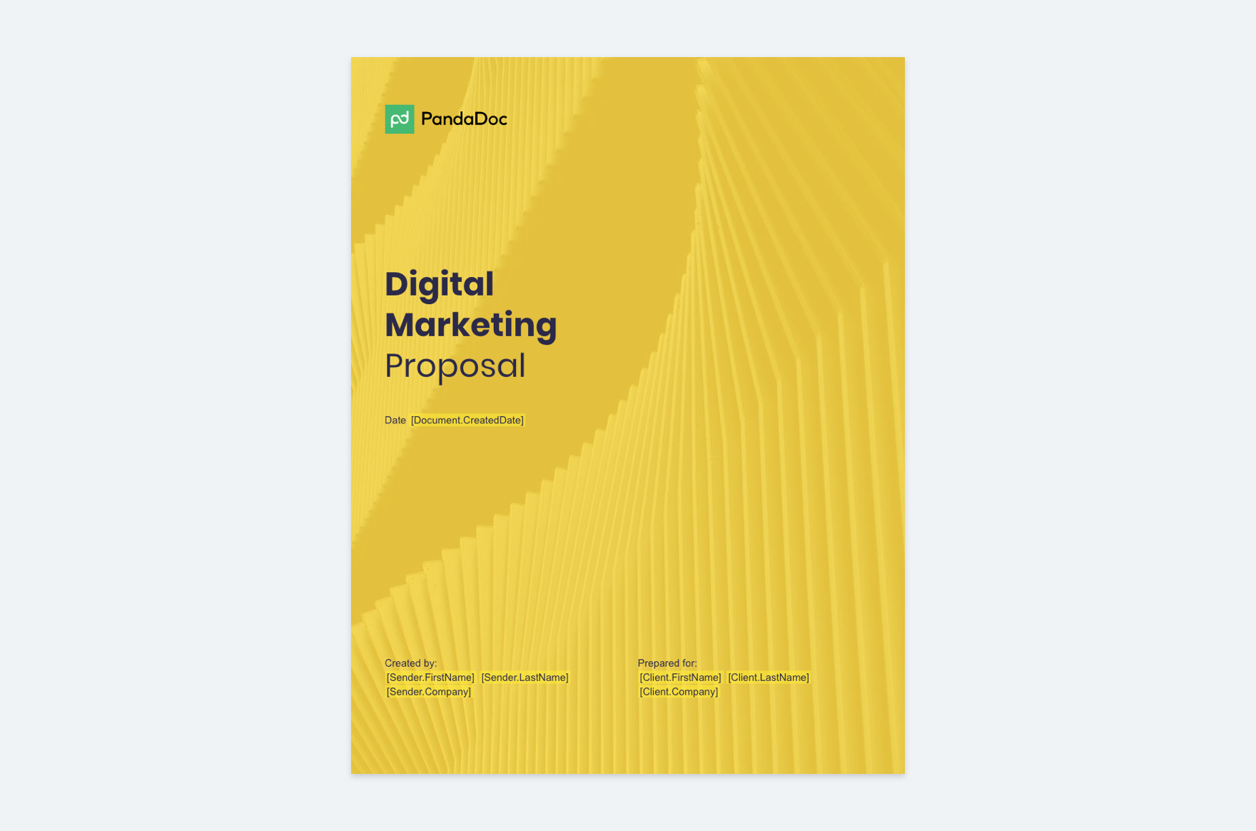
The digital marketing template’s yellow cover is associated with happiness, enthusiasm, and optimism, according to color psychology principles. Internal pages feature sans serif typography and clean imagery, both of which contribute to the template’s contemporary feel.
If your company is a more traditional firm — say, a legal or financial institution — a less flashy template option may be a better choice. But for digital marketers or agencies that want to communicate a modern, trendsetting nature, it’s a slam dunk.
Mistake #3: Presenting without video and screen sharing
If you’ve invested in creating great visuals, don’t waste their impact by sending your proposal in advance of your meeting, and then following up with a discussion over the phone. By sending your proposals ahead of time, prospects will most likely tune you out during the presentation, assuming they already have all the information they need.
Salespeople benefit immensely by discussing proposals live and in person.
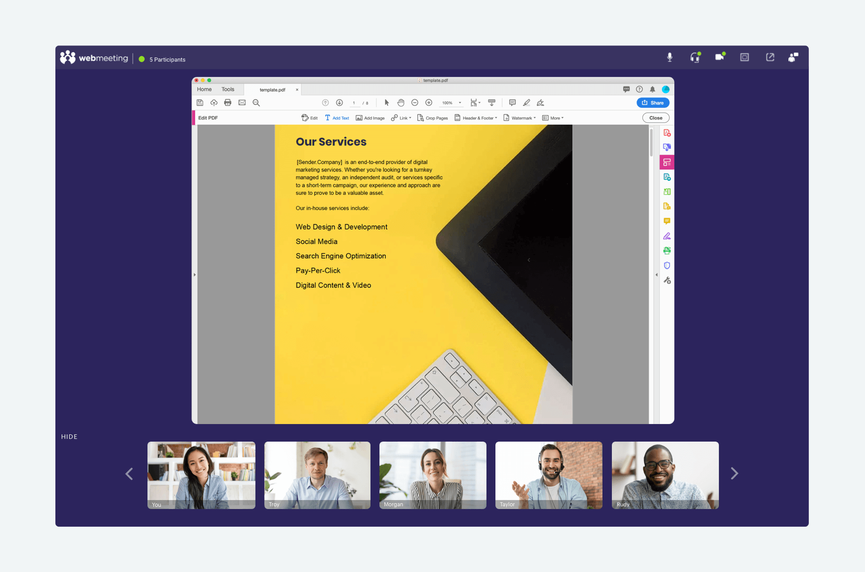
Video conferencing with Vast Conference provides a face-to-face meeting experience where you can control the flow of information via real time screen sharing — not to mention also benefiting from meeting recording, file sharing and instant messaging capabilities.
Mistake #4: Using an unreliable conferencing partner
Yes, I’m biased in favor of Vast Conference — but with good reason. Vast Conference offers an enterprise-grade cloud conferencing platform with superior HD audio and video quality. And while there are plenty of free conference call alternatives out there, believe me, you get what you pay for.

A company that uses a low-quality conferencing service to present to prospective customers probably doesn’t put much value in their business or yours. If you want to be taken seriously, look for a provider that guarantees 99.9% up-time and provides a proven, high-quality user experience.
The last thing you want is to spend your sales pitch repeating yourself, apologizing for a lagging visual feed or waiting for your prospect to download some clunky old software program.
Mistake #5: Failing to practice with your technology ahead of time
You’re no amateur. You’re past the point where you wind up fumbling through your presentation, forgetting key pieces of information or coming up blank in response to your prospect’s questions. You’re probably used to rehearsing your delivery proposal presentation.
But have you practiced how you’ll use your technology?
A system may be simple and easy to use, but you’ll still want to ensure you’re familiar with all of its functionality. Practice with your conferencing software, so that you’re confident you can manage every element of your presentation smoothly.
When you’re in Vast’s web meeting platform, it’s easy to share your PandaDoc proposal in real time. All you have to do is click the screen sharing button from the toolbar, and then choose the file you want to share.
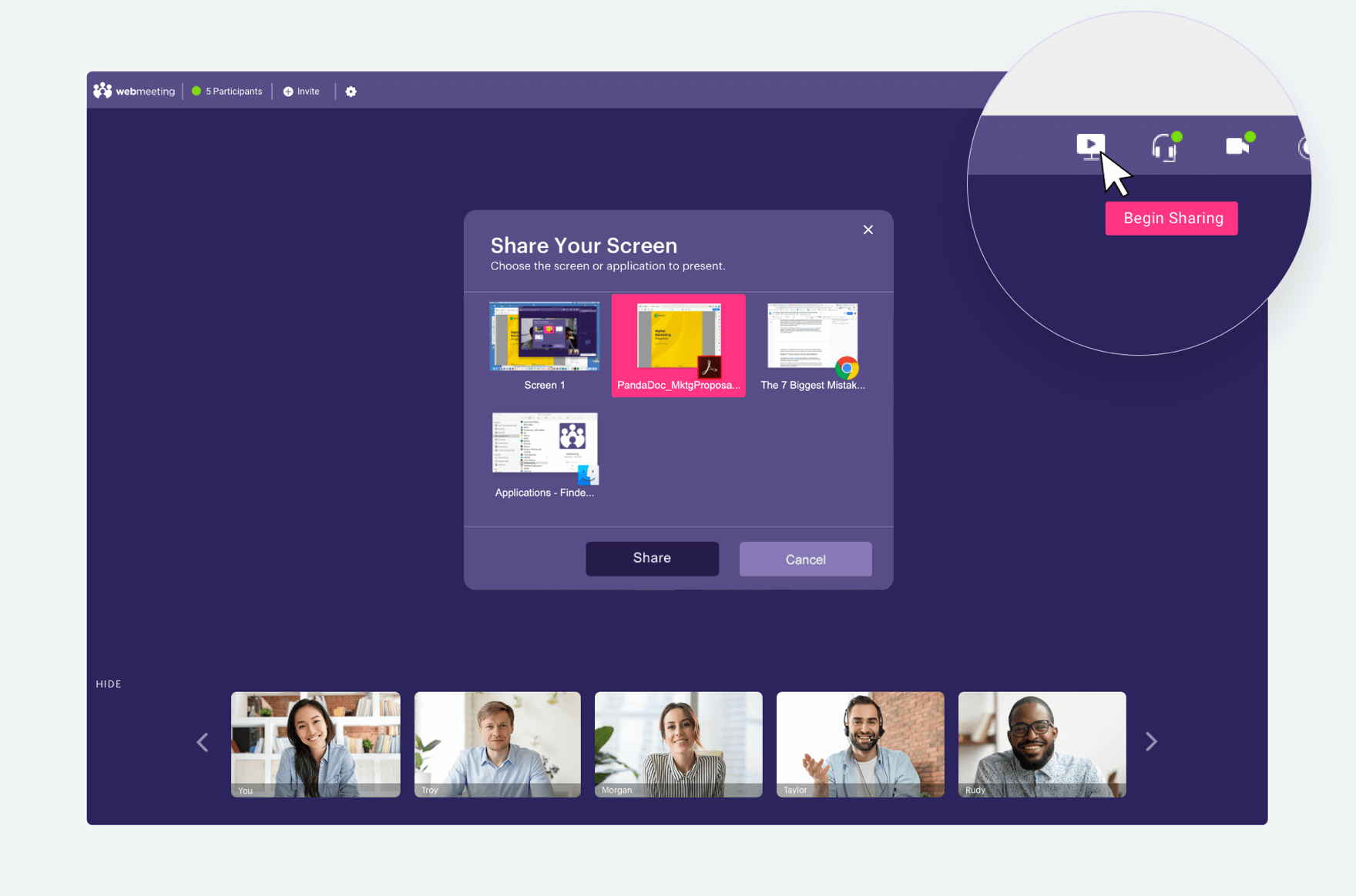
All meeting participants will literally be on the same page as you walk them through your presentation.
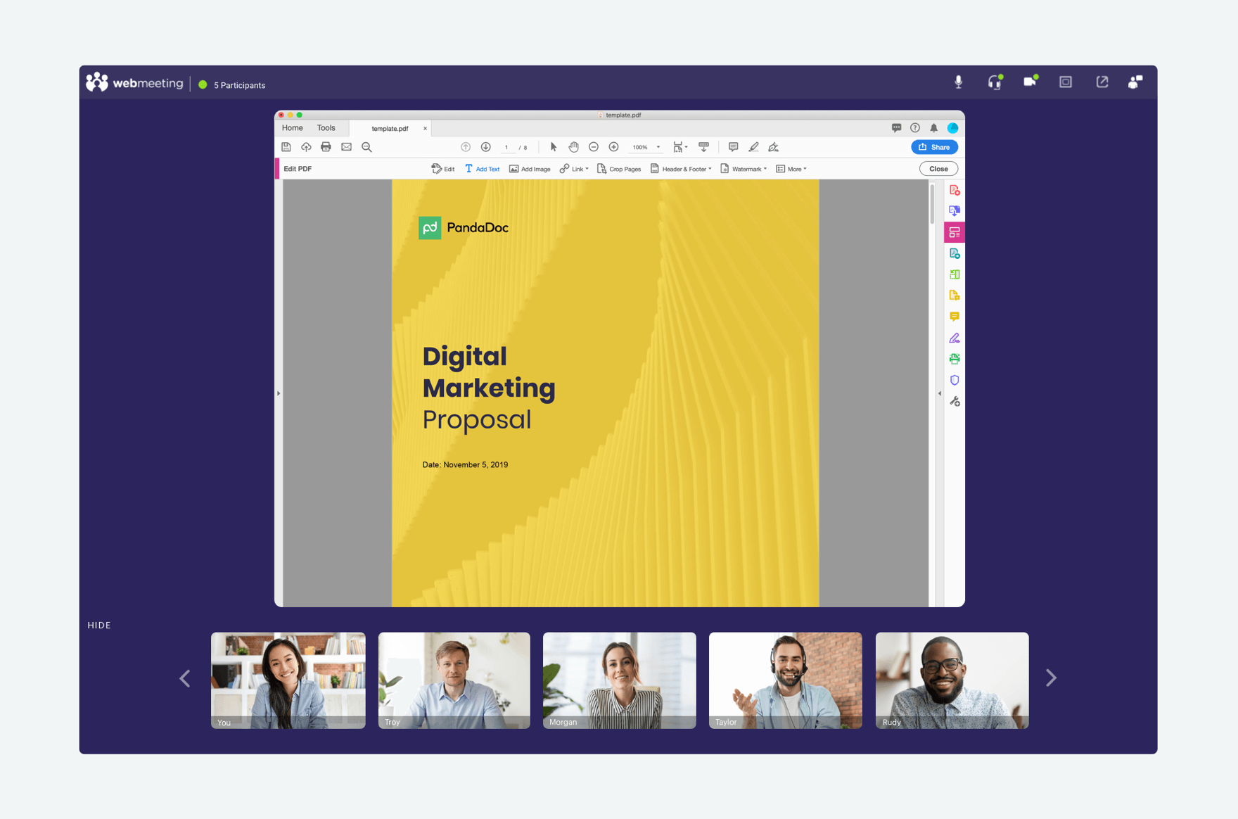
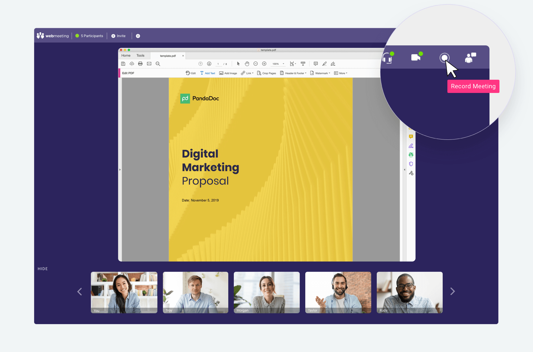
If you want to record the conversation — either to review on your own later or to download and share with prospective decision makers — click the record button in the toolbar at the beginning of your presentation.
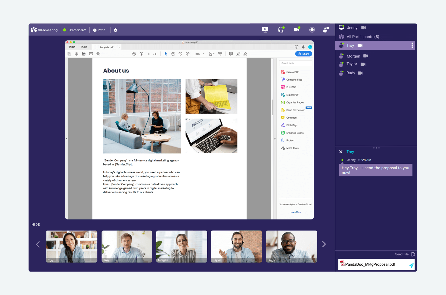
Don’t forget, all participants can share files or chat at any time during your presentation. Just find their name in the participant pane and click to highlight.
Mistake #6: Boring your listeners to tears
A good presentation is engaging, dynamic and well-paced. It isn’t dry or monotone.
So why do so many sales calls feel like you’re listening to Charlie Brown’s teacher?
One way to figure out whether you might be losing your prospect’s attention is to record your sales presentations and review them afterward. This way you can get a better feel for how your delivery is being received. Another tip is to record a practice session using the steps above, and listen to it before your presentation. This way, you’ll know if you have to alter your pacing or edit out extraneous content.
It’s also important to familiarize yourself with both body language and vocal cues that signal boredom. For example, if you’re on a video conference and you notice your prospect is fidgeting, picking at their clothes, or fiddling with their pens or phones, there’s a good chance you’ve lost their attention.
Similarly, if you’re conducting a voice-only call and you’re being met with silence or delayed responses, these are both signs you need to change course to keep your prospect interested.
Mistake #7: Failing to include a strong closing statement
“It is amazing how many presentations, even good ones, end without telling the audience what they should now go do. Or, they do give direction, but it’s vague.”
According to Mike Pacchione
Failing to issue an effective close violates the basic sales rule of “Always Be Closing.” There’s simply no excuse for not knowing what you want to get out of the call and communicating your preferred next steps to your prospect.
Are you actually trying to close the deal? Ask for the sale, the deposit, or whatever other commitment is required to move the project. Is it booking another meeting; perhaps when other stakeholders can join? Don’t be wishy-washy. Get something on the calendar, and get your prospect to commit to attending.
Closing certainly isn’t easy, and it takes some finesse to seamlessly integrate the right ask into the presentation, in the moment. But without continual effort at improving this skill, your efforts at avoiding all of the other mistakes here won’t matter. A great presentation is only great when it leads to outcomes that are mutually beneficial to both you and your prospect.
Certainly, this list isn’t comprehensive. Are there any other sales presentation mistakes you’ve identified and overcome? If so, share the lessons you’ve learned by leaving a comment below.

