Back to school: How to make design review of dev tasks
Intro
Ulyana Papova

The main DEV tasks reviewer. 💪
Design System Designer in the Marketing Department.
I have been working at PandaDoc since May 2020.
For over 3 years, has been focused on building and improving the design system of the main website and enhancing the user experience of the WP admin panel.
Ui Components
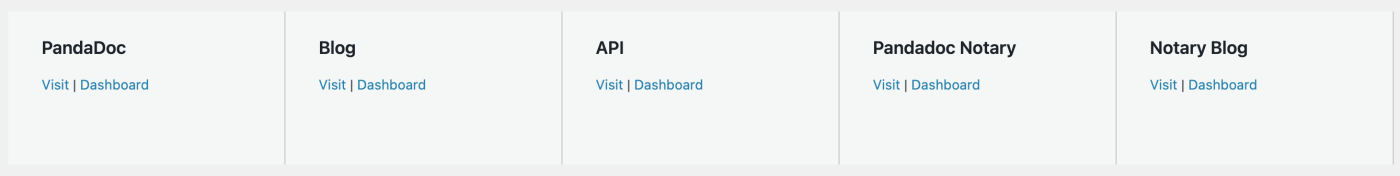
This is a developing a UI-plugin project with blocks available across all websites (Main site, Notary, API, Blog etc).
The main goal is to unify identical blocks across different projects into a single, error-free solution, with all design and content requirements and best usage practices.
Design review steps
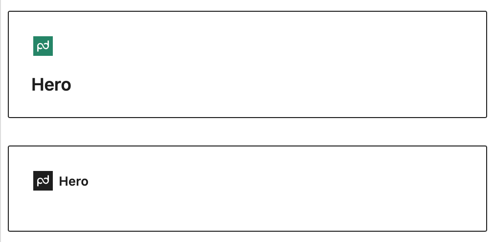
1. Visual compare
Place the block from the main theme and ui-block on one page with the same settings and make a visual comparison. Blocks should be maximum filled.
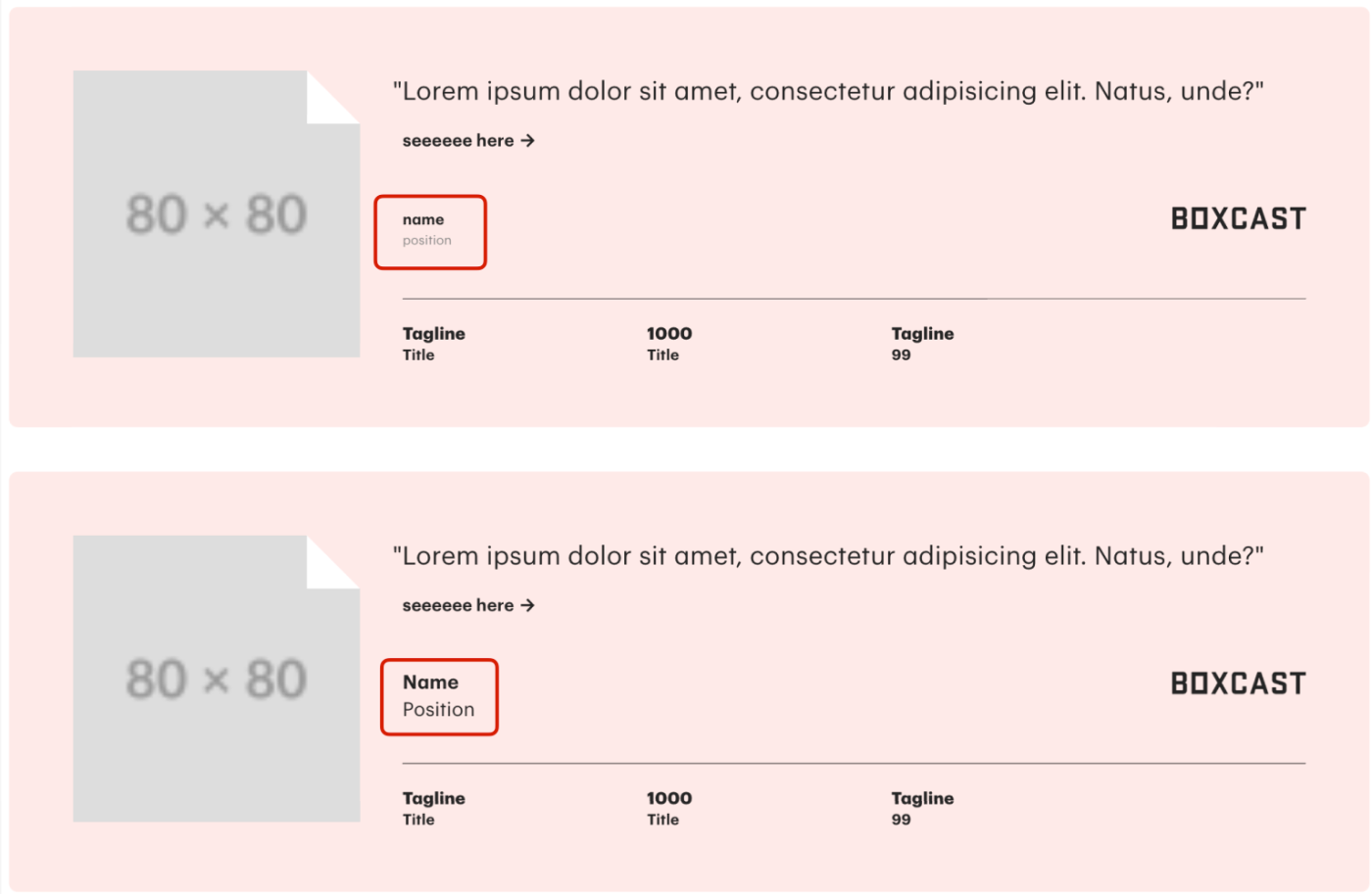
- font sizes
- paddings and margins
- colors
- default container
If there is no analogue in the main theme – compare with Figma mockup.
2. From maximum to minimum
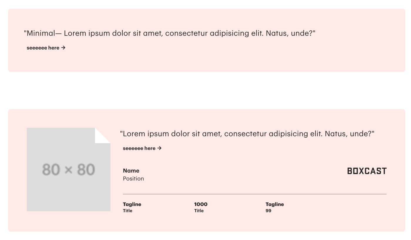
I test different variations of block content filling, from maximum to minimum.
Start removing different types of content one by one from maximum filling.
For example: Maximum filling but without ptoto. Maximum filling but without logo. Maximum filling but without metrics. Etc.
And check if the block renders on the page without any content at all. Spoiler: It shouldn’t.
Сompare all controversial points with the layout.
3. What if?
Not resticted means alloved.
If we don’t set restrictions on certain functions within the block, it means that undesirable content scenarios are possible and should be tested. Imagine the worth usage scenario – and someday you may see it on prod.

For example:
- What if there is too much text in this field? Very little text? Is no text at all?
- What if the photo is not uploaded?
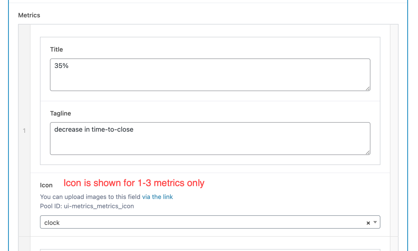
- What if there are more than 3 metrics? Empty metric is posted?
- What if different slides will have different fillings/settings?
- What if …
- What if …
…and many other whatifs.
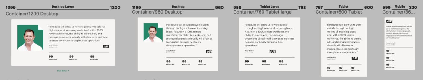
4. Adaptives
Mobile: 360-599px
Tablet Small: 600-767px
Tablet Large: 768-959px
Desktop: 960-1200px
Desktop Large: 1201 – >1400px
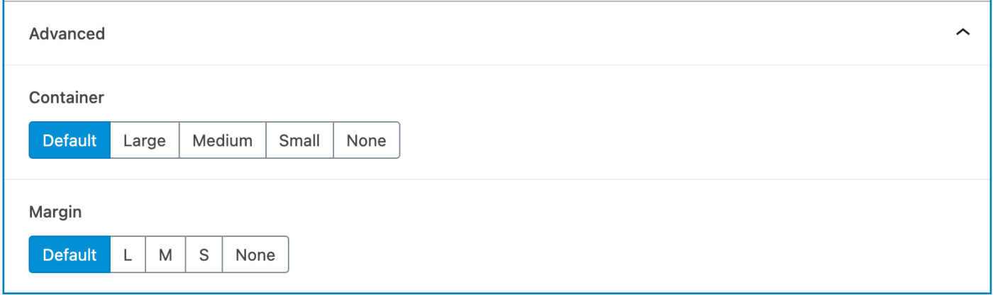
5. Advanced Settings
Check if block has advanced settings and if they work.
These two addons are obligatory.
- Container (default Wide)
- Margin (default Large 120px)
6. Admin panel
Remember, the admin panel is used by people, not robots.
Block settings should be as intuitive as possible:
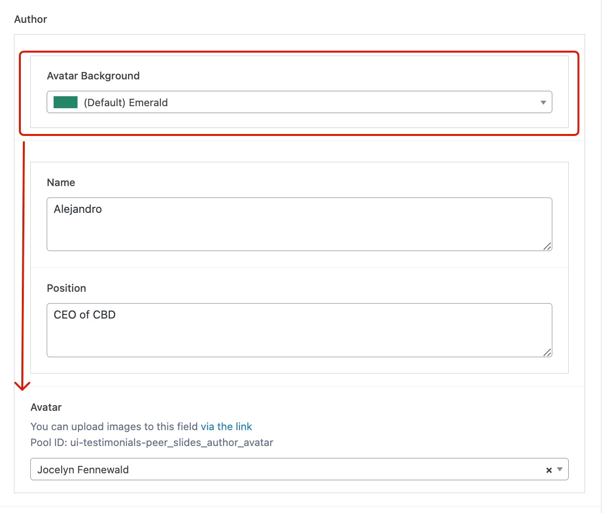
- Maintain logical order: Settings should follow a clear sequence (e.g., the title comes first, followed by the subtitle).
- Group-related settings: Settings that are logically connected should be placed together (e.g., background color selection first, followed by cover selection).
- Add helpful notes: If a setting has specific nuances, don’t hesitate to include a note nearby.
- Consistency: Use consistent naming across all settings.
Gutenberg block rules & agreements
7. Block’s peculiarities
Each block may have its own specific features. If they are mentioned in the block description or if you are aware of them, be sure to test those as well.
For example:
- Display of quotation marks in different locales within testimonial blocks,
- the most common use case for the block,
- global settings
- if the block interacts with specific post-type data,
- many others
8. Other projects
Does the block work on other projects?